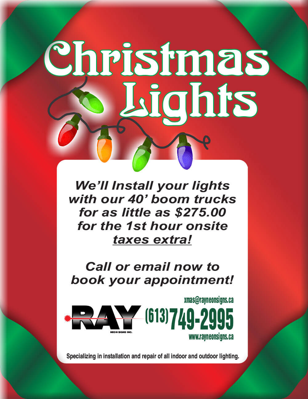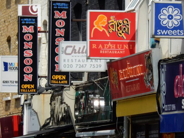
Design Tips to Make Your Storefront and Roadside Signs More Visible
For business signs to catch the attention of passersby and draw them to your store, they must be easy to read. So, if you’re designing new storefront and roadside signs for your business, you need to consider letter height. Also known as letter size, the letter height on your signs will determine how visible your signs are from specific distances. There are also other factors such as font style and colour that will influence your sign’s visibility.
Here are some design tips to make you sign easy to read and more likely to draw in customers.
Letter Height
The font size of your sign’s letters will depend on the ideal viewing distance of your signs. A general rule of thumb is to increase the font size by once inch for every 10 feet of viewing distance away from your sign—the 1” to 10’ rule. For example, if you want your sign to be visible and easy to read from 30 feet away, then the letter height should be 3 inches.
However, there are also recommended letter heights for specific sign types, such as:
- Yard and political signs—5 to 7 inches;
- Sidewalk and roadside signs—6 to 12 inches;
- Storefront window displays—8 to 12 inches;
- Event, real estate, and grand opening signs—12 to 24 inches;
- Business name signs—24 to 48 inches; and,
- Traffic and directional signs—10 to 14 inches.
Sign Colours
For optimal visibility, the font colours should contrast with the background colours on your signs. So, a light background should have a dark font and vice versa. The following are common contrasting colour combinations for optimal visibility:
- Black and white;
- Black and yellow;
- Blue and white;
- Blue and yellow;
- Green and white;
- Red and white;
- Red and yellow.
Font Style
Serif and Sans Serif are the most visible font styles, while decorative and scripts fonts are usually harder to read, especially with smaller font sizes. So if you want to improve sign visibility, but you want to use a decorative or a script font, make sure to increase the letter height to improve visibility.
Sign Placement
For both storefront and roadside signs, you must consider their placement and angle from the view of drivers and passersby. Usually, signs are more visible if they are perpendicular to a driver or pedestrian’s line of sight, as opposed to parallel to the road or sidewalk. However, if your sign placement is parallel to the line of sight, or above or below their eye level, you can still make your signs visible and easy to read with larger font sizes.
Lighting
If you place your signs in direct sunlight or brightly-lit areas, the font should be dark. Light-coloured fonts won’t be visible in bright conditions. And if your sign is in a darker area, use lighter colours for the lettering.
To ensure the best visibility for your storefront and roadside signs, make sure they are in a noticeable location and the lettering is visible from different angles and distances. Remember the 1-inch to 10-feet rule of thumb, and opt for font colours that contrast with the background. With these tips in mind, you can design a sign that is easy to read and more likely to draw customers to your business.