Tips to Design Attractive Storefront Signs in Ottawa with Effective Colour Choices
Certain colours help storefront signs attract more attention to businesses. Whether using illuminated signs or not, your choice of colours can influence customer behaviour.
Using colour psychology, market research has found that each colour evokes certain emotional and behavioural responses in customers.
So if you need new signage for your business, consider how to use colours to successfully attract customers and boost sales.
Colour Psychology
Colour is one of the most important sign design factors that will influence customers’ emotions and shopping behaviour.
Colours have a subconscious effect on our thoughts and feelings. Since vision is our dominant sense, colour is the first visual perception of a place or product that we will judge subconsciously.
How colours affect emotions and behaviours is known as colour psychology. And this plays a major role in colour market research.
There are some colours that are more likely to attract customers and encourage sales, and there are some that risk turning people away.
Sign Design Principles
There are three design principles to keep in mind when designing storefront signs:
- Compelling Colours. The colour should reflect your brand identity, while also catching the attention of customers, and evoking a desired emotion.
- Contrasting Colours. This will ensure potential customers can easily read your signage and your sign will leave a lasting impression. Consider a dark background with light letters, or vice versa. And for similar backgrounds and letter colouring, opt for dark outlines on the letters.
- Letter Height. The size of the letter will also affect how easy your signs are to read. Depending on where you place your signs, make sure they are visible from a distance. Font will also influence readability, with cursive fonts being more difficult to read.
Colour Combinations
You want colour combinations that are easy on the eyes. Stick with a maximum of three colours that go well together. Too many colours, or the wrong combination of colours, will turn off potential buyers.
- Black, red, orange, and royal blue attract impulse buyers;
- Pink, teal, light blue, and navy blue attract budget-wise shoppers;
- Bright primary colours attract children—and influence parents to buy for their children;
- Highly-educated shoppers tend to prefer obscure colours; and
- Working-class shoppers tend to prefer well-known colours.
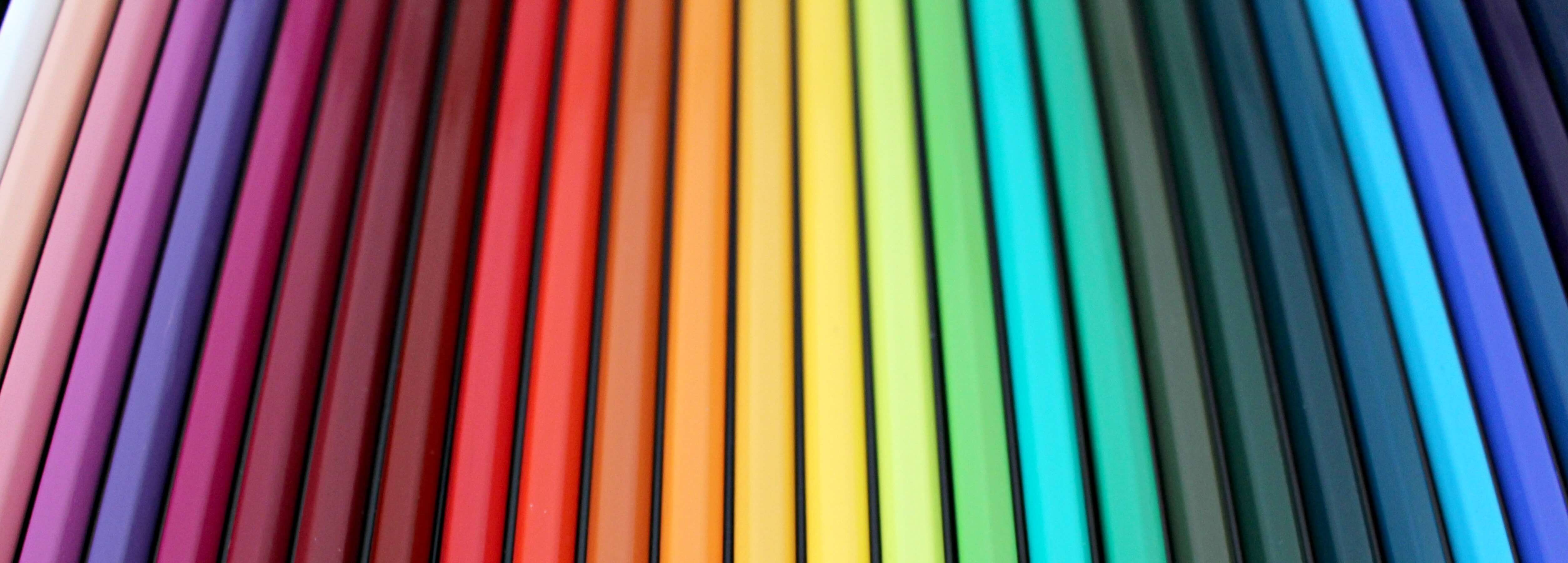
Top Colours to Increase Sales
Reds and warm tones are incredibly popular colours for marketing. Red, in particular, grabs and holds attention, and can be used to indicate power. Yellow, meanwhile, is powerful, confident, and commands attention (notice how common it is in construction sites?). Orange splits the difference, evoking energy and fun simultaneously.
On the cooler end of the spectrum, blue is incredibly popular in terms of marketing, especially when paired with complementary colours like gold or orange. It’s a trustworthy tone, which makes sense given how closely it’s come to be associated with clinics and doctors.
Green, meanwhile, is inviting, leaving customers feeling pleased. It can also signify health, wealth, the environment, and goodwill.
Purple and gold add prestige, elegance, and power, very fitting for these colours once reserved for royalty. It helps they go well together, too! Earth tones, in turn, are relaxing, perfect for a down-to-earth look and feel. Black is incredibly versatile and can be paired with a variety of colours, either to complement or support those tones.
To attract potential customers, keep these colour design tips in mind when upgrading to eye-catching signs in Ottawa.